TripSplit
Collaborative Trip Planning & Expense Management App
Year
2026
Timeline
4 days
Role
Product Designer
Project Type
Design Challenge
At-a-glance
TripSplit is a mobile product concept created during a 4-day product design challenge. The brief provided a product scenario, user profiles and behavioural insights around group travel planning, decision-making and expense settlement. My role was to translate those inputs into an end-to-end mobile experience, from wireflow to high-fidelity screens.
Problem
Planning a trip with friends is enjoyable, but coordinating decisions during the trip can quickly become frustrating. Groups often need to decide where to eat, keep everyone updated, add new participants and split expenses fairly.
Challenge
Design a mobile experience that allows users to collectively plan a trip, make quick group decisions and manage invites and shared expenses with minimal friction.
User profiles
- The Organizer, who sets up the trip, invites people and keeps the group moving
- The Participants, who want to stay involved and informed without being overwhelmed
User insights
The brief provided several behavioural insights about how people coordinate group trips. I used these as the foundation for the design direction rather than conducting new primary research.
The key insights were:
- Many decisions happen spontaneously during the trip. To take them, users prefer quick tools such as polls over long group chats
- Once a decision is made, spontaneous or not, users expect the itinerary to update immediately
- Users have a low friction tolerance. If a flow takes too many steps, users are likely to switch to chat apps
- Group expense management and settlement is extremely valued. Therefore, it is critical that expenses are simple, fast and easy to manage and settle
Research and references
Before designing, I reviewed competitor products, reference apps and existing patterns across travel planning, collaborative decision-making, itinerary management and expense splitting. This helped me understand which interactions were already familiar to users, where the experience could be simplified and what additional features would be useful to include.
During the design process, I also referred to mobile guidelines, existing design systems and best practices to make decisions around navigation, form structure, voting interactions, payment flow clarity and visual hierarchy.
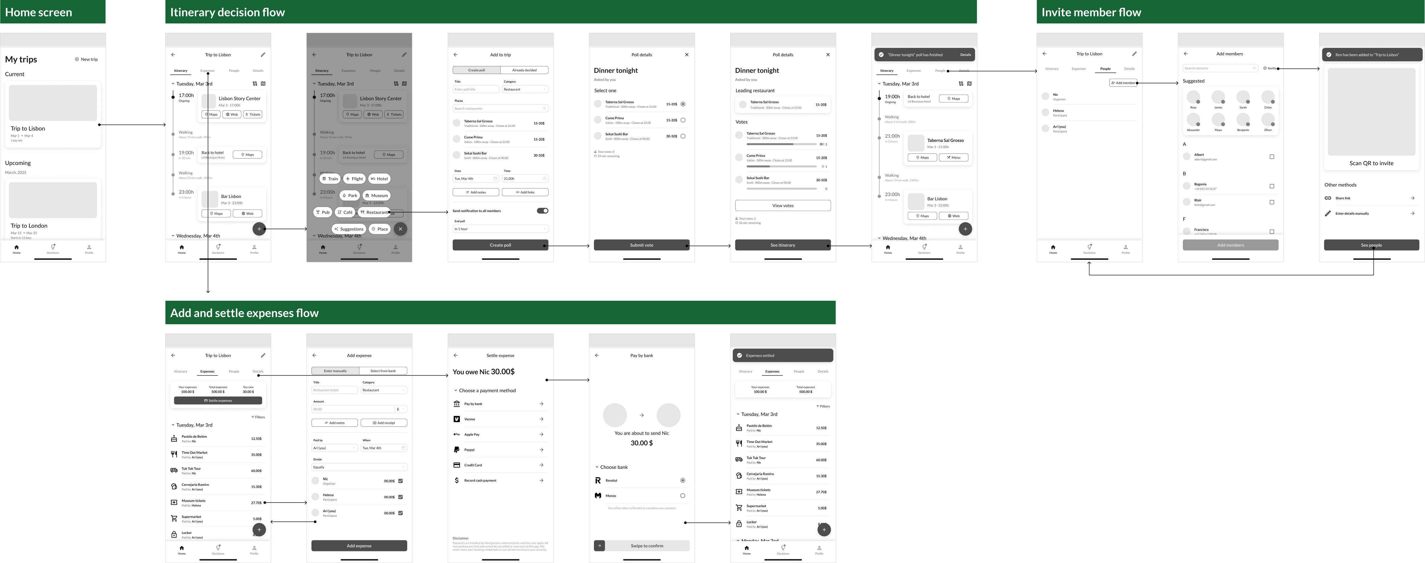
Core flows designed
I mapped the experience around three connected flows:
- Creating and voting on a group decision, integrating the winning poll result into the itinerary
- Adding, splitting and settling shared expenses, including in-app payment methods
- Invite member flow, either before or during the trip
Design decisions
Dedicated decision-making tab
This gives users a clear place to create, follow and resolve group decisions without having to search through the itinerary or rely on chat-style conversations. The goal was to make frequent mid-trip decisions, such as choosing where to eat, feel fast and structured.
Tabs ordered by frequency of use
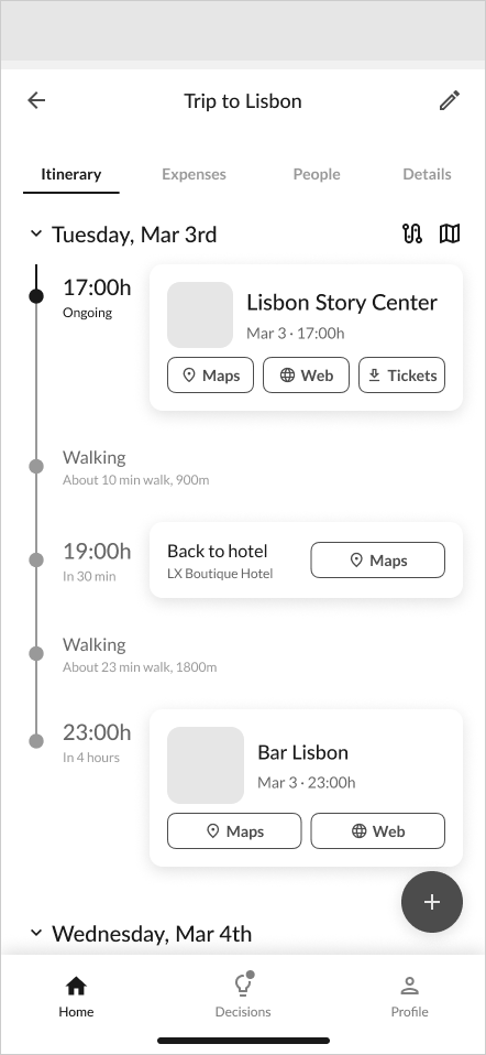
Inside each trip, I separated content into tabs based on how often users would need it. Details holds important but less regularly accessed information such as accommodation, bookings or trip settings.
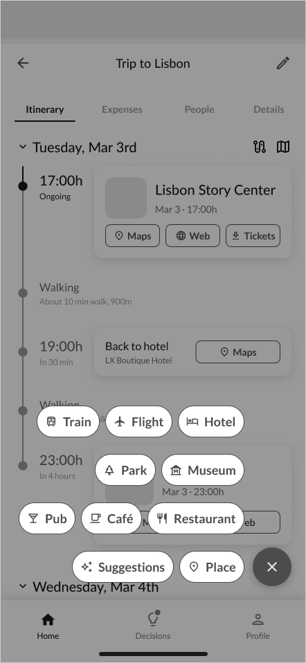
Add-to-itinerary actions ordered by frequency of use
The add menu was horizontally organized by category, with more common actions placed closer to the main button. This makes frequent additions faster to reach while keeping the menu scannable.
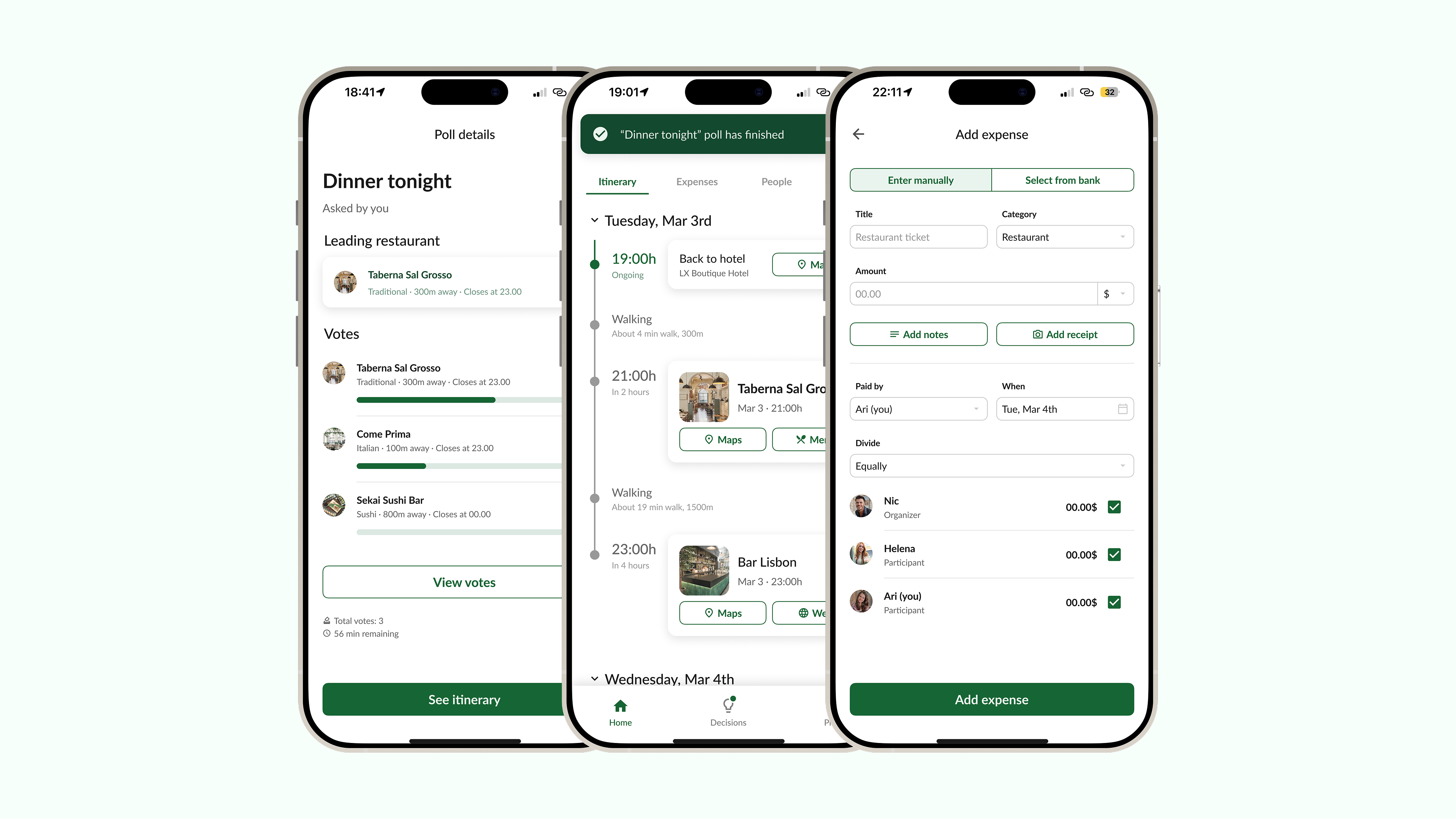
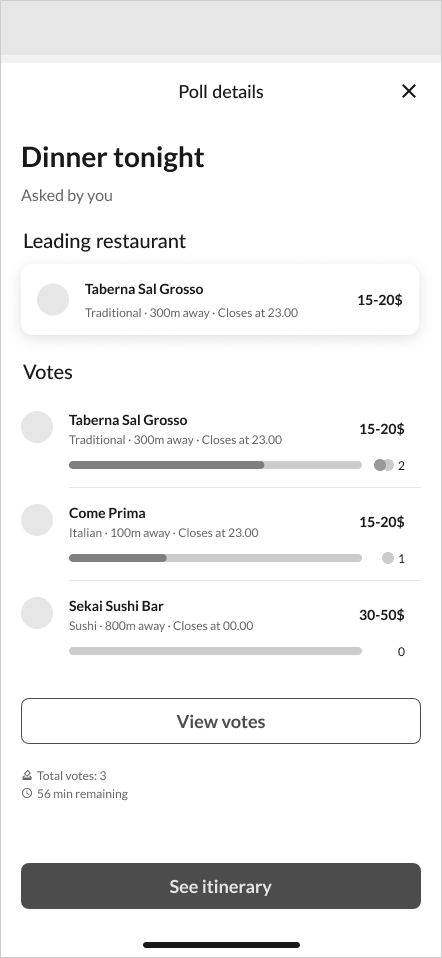
Quick polls for group decisions
Polls give the group a fast, structured way to decide. Many decisions happen spontaneously during the trip, and users prefer quick tools such as polls over long group chats.
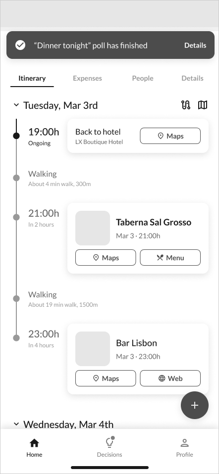
Poll results integrated into the itinerary
The winning poll option is automatically added to the itinerary. This keeps the group aligned and turns a decision into an actionable plan without extra manual work and supports the need for real-time feedback and shared visibility.
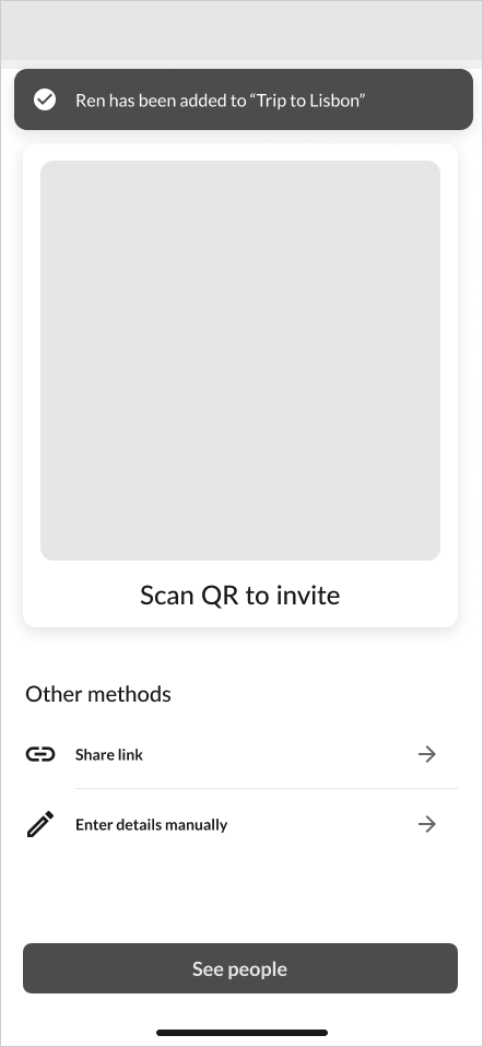
QR code for low-friction invitations
I included a QR code invite option to make it easier to add someone in person during the trip, especially when a new member joins last minute or mid-trip as in the brief.
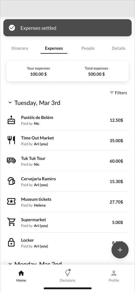
Expense management connected to the trip
The expense flow stays inside the trip context, allowing users to add costs, select participants, adjust splits and settle balances without switching to external tools.
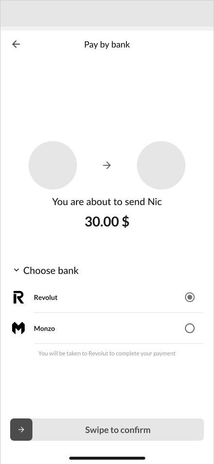
Settlement with in-app payment
Settlement closes the loop with an in-app payment flow and a deliberate swipe-to-confirm gesture that prevents accidental sends.
Dedicated decision-making tab
Tabs ordered by frequency of use
Add-to-itinerary actions ordered by frequency of use
Quick polls for group decisions
Poll results integrated into the itinerary
QR code for low-friction invitations
Expense management connected to the trip
Settlement with in-app payment
Planned extra features
Optimize route
I planned an AI-powered route optimization feature that would suggest the best order for itinerary places based on user-selected criteria such as reducing walking distance, minimize travel time or group nearby activities together. This would help users make the itinerary more efficient.
View full route on map
This would allow users to visualize the complete itinerary route and understand how each stop connects to the next one. The goal was to reduce the need to constantly open external map apps and help users move around the city more confidently during the trip.
Select expense from bank
For the expense flow, I planned an option to select an expense directly from the user's bank transactions. This would reduce manual input by pre-filling information, making expense tracking faster and more accurate.
Next steps
Validate the concept with users
The next step would be to test the main flows with users, especially the design making flow, the poll-to-itinerary interaction, the invite flow and the expense settlement flow. This would help validate whether the structure is clear, fast enough and useful during an active group trip.
Design the planned extra features
I would also continue the concept by designing the planned extra features, helping make the app more useful beyond the core scenario.
Build an interactive prototype
I would also create a more complete interactive prototype, potentially using AI tools to speed up the process, generate realistic content and test different flow variations faster. This would make it easier to simulate the full trip experience and gather more actionable feedback.