Goodread's Redesign
Redesigning the Book-tracking's User Experience
Year
2025
Timeline
5 months
Role
Product Designer
Project Type
Master's Thesis
At-a-glance
Goodreads is one of the most widely used book-tracking platforms, but has been frozen in time. Users frequently report poor navigation, outdated visuals, limited customisation and missing features.
This project explores the redesign of Goodreads' mobile application with the goal of improving its user experience and modernising its interface. The work focuses on understanding how people track their reading, how social reading platforms shape behaviour and why the current solution does not meet the users' expectations anymore.
My role: Product Designer
I led the project end to end, from research and problem framing to visual design and evaluation. This included planning and conducting user research, analysing competitors, defining requirements, designing the information architecture, creating the design system and producing the final interactive prototype.
The project's timeline, from start to finish, was of about 5 months.
Challenge
Rethinking the mobile experience while respecting the platform's identity, addressing common usability issues, adding demanded features, designing for scalability and aligning the product with current reading habits and design standards.
Target Users and Their Needs
Two personae guided the redesign — explored in detail in the Personae section below.
Solution
The outcome is a fully redesigned mobile experience supported by research, a design system and a high-fidelity interactive prototype, developed following a User-Centered Design approach; and prioritizing clarity, flexibility and visual consistency.
The redesign introduces:
- A simplified and more intuitive navigation structure
- Clearer information hierarchy across key screens
- Improved book discovery, tracking flows and habit setting features
- Richer but optional social interactions
- A modernized brand identity
- A cohesive design system that ensures consistency and scalability
The final result is presented as a high-fidelity interactive prototype, supported by a complete design system and validated through usability testing.
Methodology
User-Centered Design
The methodology ensured that design decisions were based on research and continuously validated against user needs.
Design Process
Understand the Context of Use
Research and State of the Art
The first step was conducting an analysis of Goodreads' history, current features and public perception was conducted, alongside research into reading trends and the influence of online reading communities. More can be read in the full thesis (link tbd).
Benchmarking
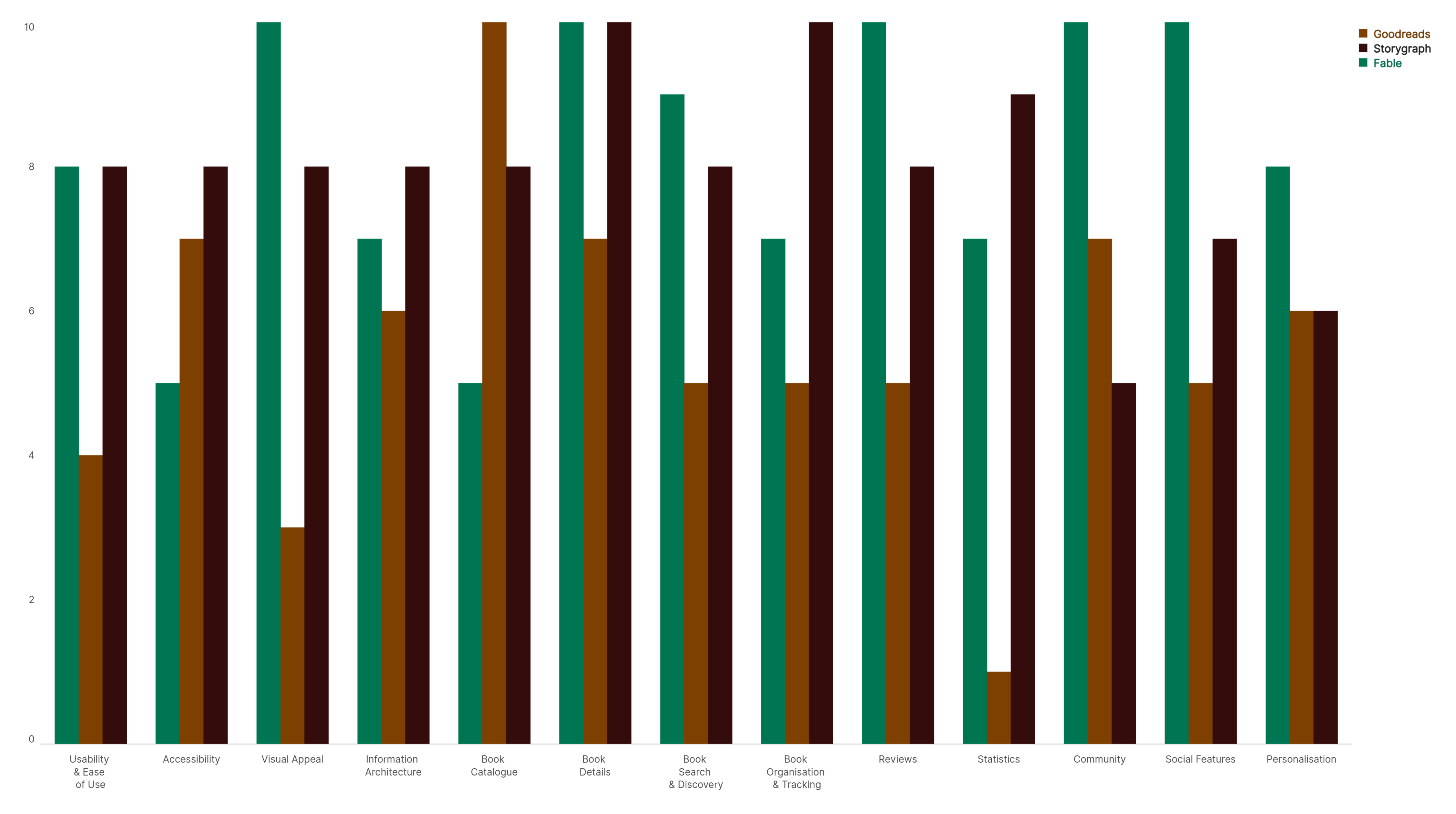
A comparative analysis was conducted between Goodreads and its main competitors, StoryGraph and Fable, to identify strengths, gaps and differentiation opportunities. The benchmarking revealed that, while Goodreads benefits from scale and an established community, it significantly underperforms in usability, visual clarity and feature depth on mobile.
Competitors stood out in specific areas: StoryGraph for its data-driven insights and reading analytics and Fable for its community-first approach and social engagement. These findings highlighted clear opportunity areas for the redesign, mainly around navigation, reading statistics, review flexibility and modern visual standards, while also identifying features and patterns that should be avoided.
Focus Group
To complement the competitive analysis, a focus group was conducted with four potential users (readers of different ages and reading habits) and based on a structure with eight theme blocks.
Participants shared frustrations with Goodreads' outdated interface, slow performance and confusing navigation. Another recurring theme was the feeling of being overwhelmed by information that did not directly support core reading tasks. They also expressed interest in better tracking features, more meaningful insights into their reading habits and updated social features. These insights directly informed prioritisation decisions for the redesign.
Personae
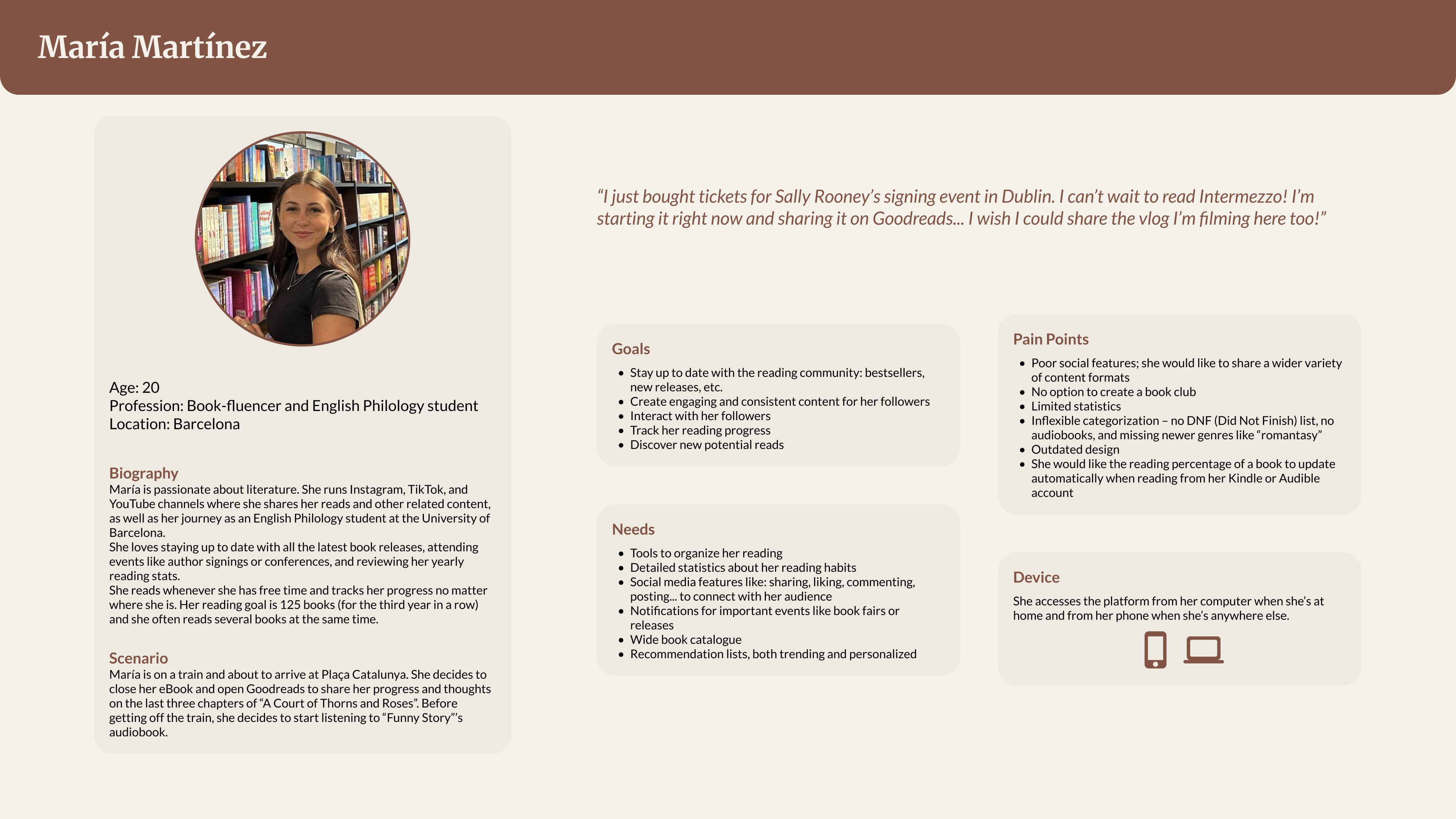
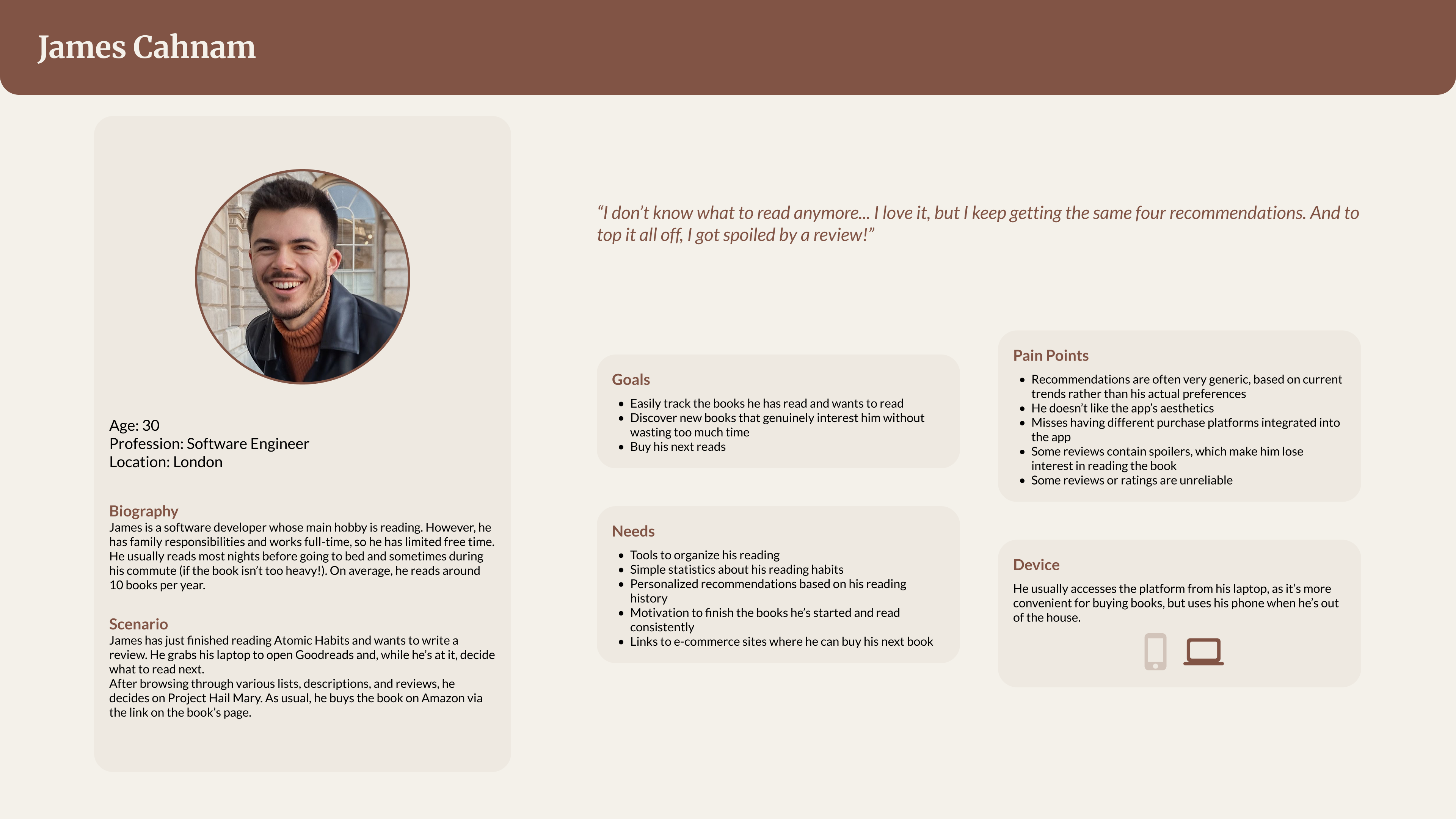
Based on research insights, two personae were defined to guide design decisions. The first one (María Martínez) represents a socially engaged reader who enjoys interacting with the reading community, sharing opinions and discovering books through others. The other (James Cahnam) represents a more pragmatic reader who values structure, efficiency and personal tracking over social interaction.
These personae were used throughout the design process to evaluate decisions, ensuring the product could support different reading motivations equally, without giving more importance to one of them. They helped when a compromise was needed, for example, around social visibility, information density and navigation complexity.
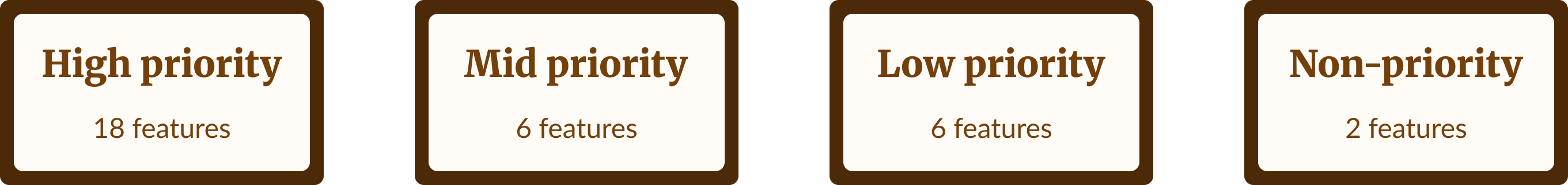
Specify User Requirements
Insights gathered during research were synthesised into a set of user and product requirements. These requirements defined priorities for the redesign, balancing usability, flexibility and visual appeal.
Key areas included navigation clarity, reading statistics, content organisation, review workflows and social interaction features.
Design Solutions
Customer Journey Map
An expected Customer Journey Map was created to model a realistic reading scenario: finishing a book and starting a new one using Goodreads on the mobile app. The journey is structured into three phases (post-reading, pre-reading and reading) and breaks the experience down into concrete steps such as updating reading status, writing a review, browsing recommendations, deciding on the next book and beginning a new read.
For each step, the map documents user actions, effort, thoughts, emotional state, pain points and improvement opportunities. This made visible friction points in the existing experience, particularly around reviewing, progress tracking and book discovery and served as a reference for future design decisions.
Visual Identity
The visual identity was redesigned to modernise Goodreads while maintaining brand recognisability. This step included an update of the logotype, defining new variations adapted to different contexts and screen sizes.
Alongside the logotype, a revised colour palette and typographic system were introduced to improve hierarchy, contrast and readability across the interface. These changes aim to support content-heavy screens and long reading sessions, addressing the platform's previously outdated and visually dense appearance.
Design System
A design system was created to ensure consistency and coherence across the redesigned application. The system is structured following an atomic design approach, starting from foundational elements such as colours, typography and spacing and scaling into reusable components.
The system defines inputs, buttons, navigation elements, cards and social components, including review-specific cards. This structure allows complex content such as reviews, statistics and social interactions to be presented consistently, while supporting scalability and future development.
Sketches
Sketches were used as an initial exploration phase to test layout ideas and screen structures for the main sections of the app. These included key areas, flows and functionalities.
Working at low fidelity allowed for quick iteration and comparison of alternatives before committing to more detailed layouts.
Wireframes
Wireframes translated the selected sketch solutions into clearer layouts, focusing on structure, hierarchy and navigation flow but without introducing major structural changes. This stage refined how content and actions are distributed across screens and ensured consistency between different sections of the application.
High-Fi Screens
High-fidelity screens applied the new visual identity and design system to the defined layouts.
At this stage, typography, colour, spacing and components were combined to create a cohesive and realistic representation of the redesigned experience.
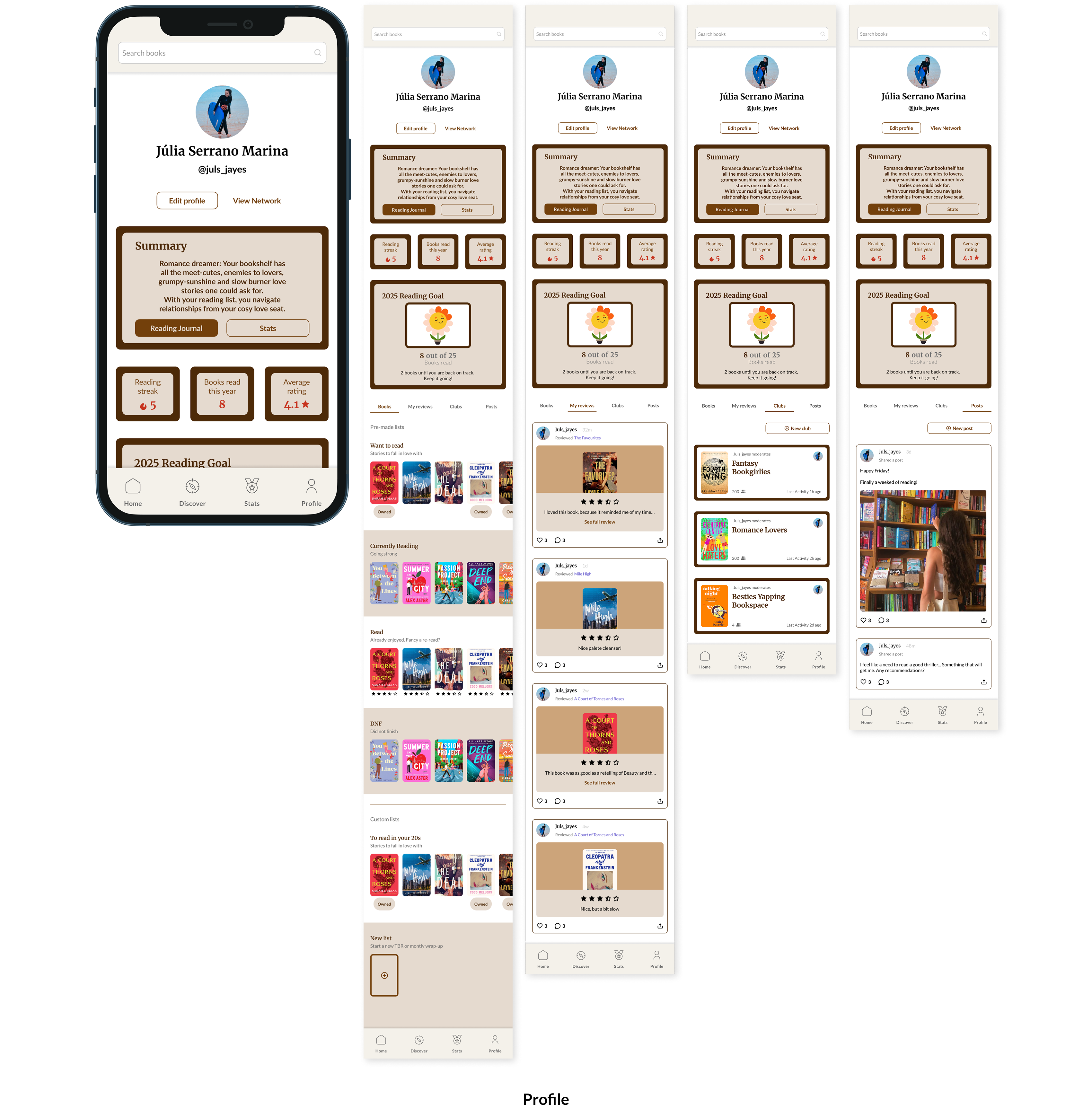
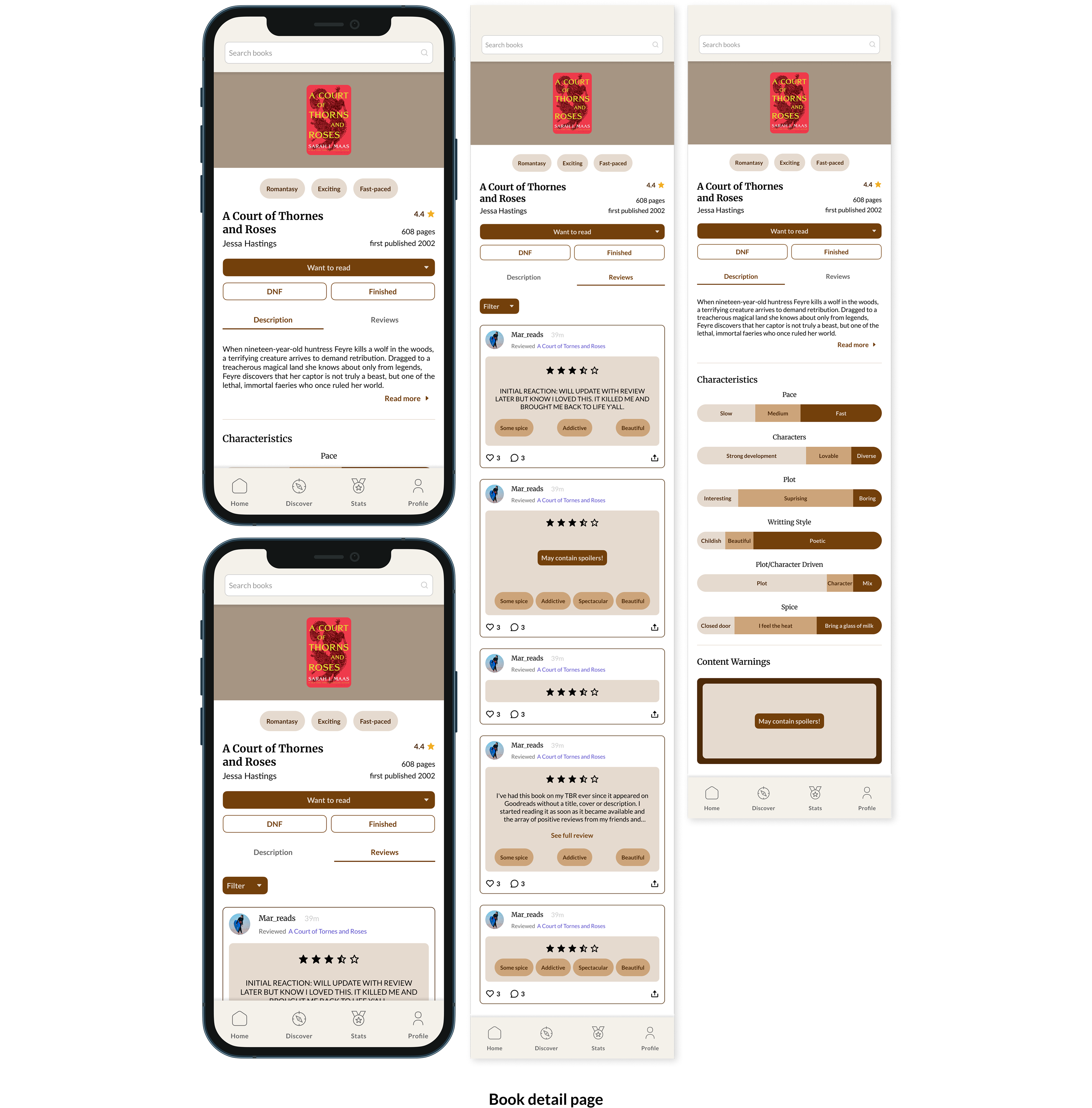
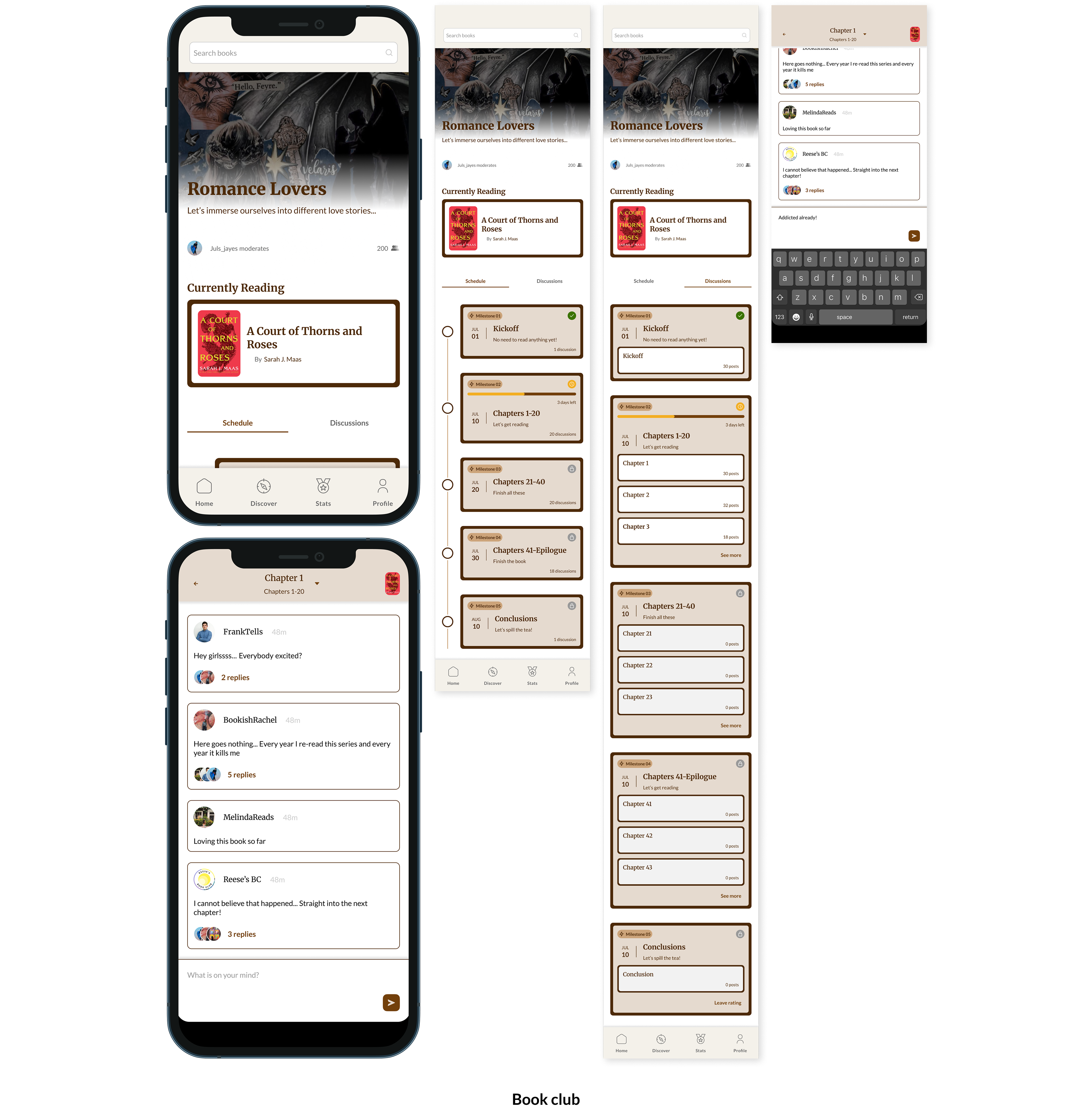
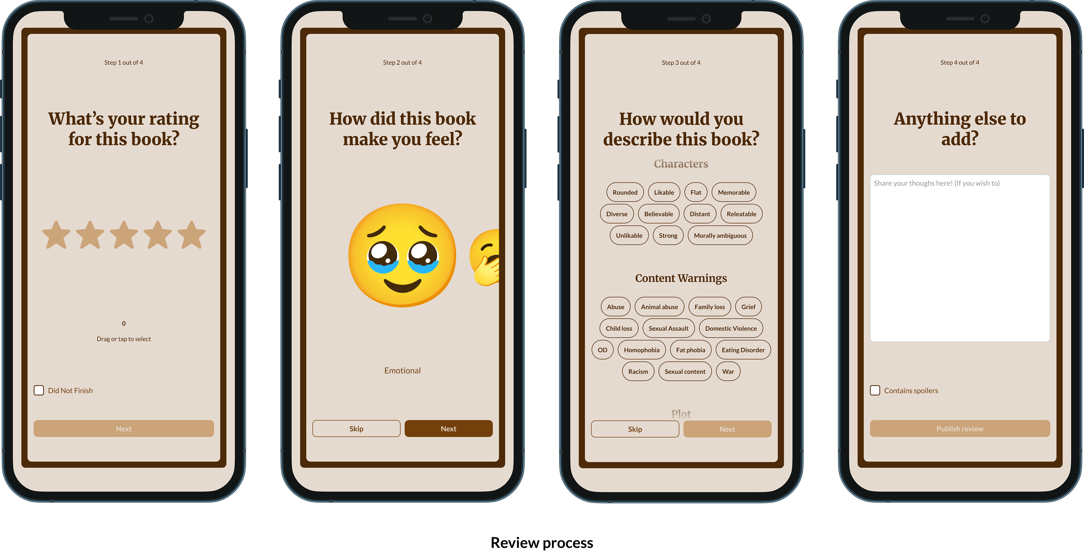
Prototype
The high-fidelity screens were connected into an interactive prototype to simulate navigation and key user flows and other interactive features were also added.
The prototype represents the redesigned Goodreads mobile experience and was used as the basis for usability testing in the evaluation phase.
This allowed the proposal to be assessed as a complete experience rather than as isolated screens.
An explanation video (in Spanish) — link tbd.
Evaluate against requirements
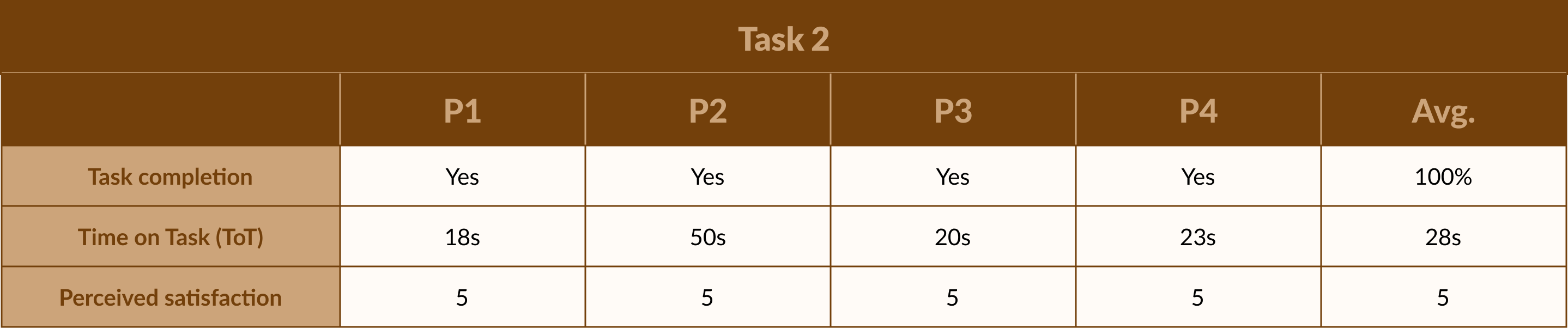
A usability test was conducted in order to evaluate the redesigned application using the high-fidelity interactive prototype. Participants were asked to complete representative tasks such as tracking reading progress and reviewing a book. The evaluation focused on task completion, time of completion and perceived satisfaction.
The results showed that users were able to navigate the interface intuitively, with clear improvements in information hierarchy, feature discoverability and overall visual comfort. The evaluation confirmed that the redesign meets the defined user and project requirements, while also identifying minor opportunities for future iteration. Overall, this phase validated the proposal as a usable, coherent and scalable redesign grounded in user-centered design principles.


Project Conclusion
This project demonstrates how a research-driven, user-centered approach can transform an established product without losing its core identity. The redesigned Goodreads mobile experience addresses long-standing usability and aesthetic issues while adapting the platform to contemporary reading habits.
Beyond the final prototype and interface, the project is valuable as a complete design process. The structured application of UCD, the creation of a scalable design system and the validation through usability testing ensure that the proposal is not only visually refined but also grounded in feasibility and user needs. The work establishes a solid foundation for future iterations or real-world implementation, showing how research-driven design can translate into a coherent, usable and extensible product solution.